Why do we need financial data of companies
If you’re just starting to create programming tools to guide your financial choices, you’ll want to have data on the companies you intend to investigate — and this can be complex when you’re just starting out.
Fortunately, we have some Python libraries that can be used for this purpose. These libraries can primarily provide data on asset prices over the time interval of interest.
Note that if you want to perform sentiment analysis or check company-specific reports (such as documents issued in “investor relations”), we will have later guides to crawler this. This one focus mainly in stock prices.
Python being used to the fullest
The libraries we will mention can be easily installed in Python. Some of them are paid, but we will make it clear as we describe
YFinance
This is a really useful free library we will be using in our examples. It collects financial data directly from Yahoo Finance and it’s a simple tool to get stock prices and indices. To install it you can do the following:
pip install yfinance
Alpha Vantage
This library offers free access to historical and real-time data for stock prices, currencies, and cryptocurrencies, but you can do a maximum number of requests per minute. It is free, but you have paid subscription options for advanced features and increased request capacity
To install you can do the following:
pip install alpha_vantage
IEX Cloud
This library has limited free-level access, offering real-time and historical financial data, along with stock prices and related news. To install this you need to visit the IEX Cloud website (https://iexcloud.io/) and obtain an API key. Then, install the library with:
pip install iexcloud
Quandl
A reliable source of financial and economic data, including stock prices, futures, and options. It is also paid.
Before installing you need to get an API key from the Quandl website (https://www.quandl.com/). Then you can install using pip:
pip install quandl.
ccxt
Finally, this library is an open-source library that offers access to various cryptocurrency exchanges. Useful for collecting prices and information on cryptocurrencies from different exchanges.
To install you can use pip:
pip install ccxt.
Example using yfinance to get TSLA stock price
The first step is to install yfinance.
As stated before, you can simple do:
pip install yfinance
Some other libraries are used behind the scenes so they will be installed as needed by pip.
Once yfinance is installed, you can use it in your python scripts. For this, import the library using:
import yfinance as yf
Great. Now, as a good practice, define variables for your stock ticker (TSLA), the start_date you want to crawl, and the end_date. For instance, for crawling data from 2020 to the end of 2022 your variables will look like this
ticker = 'TSLA'
start_date = '2020-01-01'
end_date = '2022-12-31'
Finally, call the yfinance download function
tesla_data = yf.download(ticker, start=start_date, end=end_date)
After this you can print your financial info by doing
print(tesla_data)
Here is your output
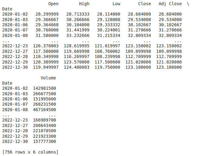
This is ugly, right? Fortunately, we have some better ways to present this data.
But first, let’s go through the values we have and what they mean:
- Date: The index. Literally the day the data refer to.
- Open: The opening price of a stock for that day.
- High: The highest price the stock reached during that day.
- Low: The lowest price the stock reached during that day.
- Close: The closing price of a stock for that day.
- Adj Close (Adjusted Close): The closing price is adjusted for events like dividends and stock splits, providing a more accurate picture of a stock’s performance.
- Volume: The total number of shares or contracts traded during that day, indicating the level of market activity.
Depending on what you want to do, it makes sense to use the adj. close, as it represents the real value if there has been a split in the day.
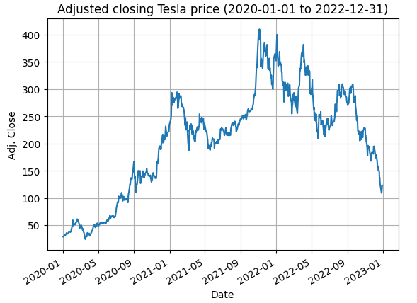
That said, let’s visualize this data. For this, we will use the matplotlib. A simple yet powerful library in Python.
To install you can do the following:
pip install matplotlib
And then, for using you can do
tesla_data['Adj Close'].plot(title=f'Adjusted closing Tesla price ({start_date} to {end_date})')

plt.xlabel('Date')

plt.ylabel('Adj. Close')

plt.grid()

plt.show()
This code will:
- Plot a graph using “Adj Close” values
- Add a title, and label the variables x and y as “Date” and “Adj. Close” respectively
- Grid this graph
This will look like this:
This is looking better, but depending on what you are going to use the graph for, it may make sense to know the variation of the stock from the moment of purchase (starting date) to an ending date and in this case you want a graph of the percentage variation in relation to the starting price (“Adj close” in position 0). To do this is very simple:
tesla_data['relative_return'] = (tesla_data['Adj Close']/tesla_data['Adj Close'][0] - 1)*100
This will create a new entry in tesla_data named relative_return. It will show (in percentage) the return from buying on the starting date and selling on that specific date.
It’s also good to mark in the graph the starting and ending points. So the graph will look like this:
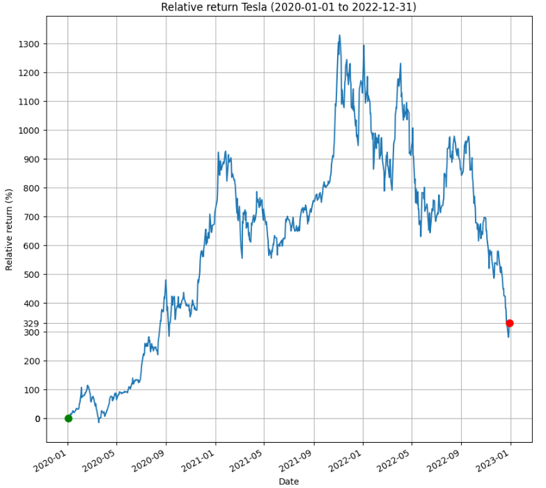
That way we can easily see that if we buy on the starting date and hold to sell on the ending date we would make approximately 329% return from our investment.
Oh, here’s the code to build this graph by the way:
import yfinance as yf

import matplotlib.pyplot as plt

import math

ticker = 'TSLA'

start_date = '2020-01-01'

end_date = '2022-12-31'

tesla_data = yf.download(ticker, start=start_date, end=end_date)

# calculating relative return

tesla_data['relative_return'] = (tesla_data['Adj Close']/tesla_data['Adj Close'][0] - 1)*100

# width and height of the image

plt.figure(figsize=(10, 10))

# plotting values of interest

tesla_data['relative_return'].plot(title=f'Relative return Tesla ({start_date} to {end_date})')

plt.plot(tesla_data.index[0], tesla_data['relative_return'][0], marker='o', markersize=8, label='Initial point', color='g')

plt.plot(tesla_data.index[-1], tesla_data['relative_return'].iloc[-1], marker='o', markersize=8, label='Last point', color='r')

plt.xlabel('Date')

plt.ylabel('Relative return (%)')

# y values to plot show in the axis. Starting and ending point as well as each 100 interval

y_values = [tesla_data['relative_return'].iloc[0], tesla_data['relative_return'].iloc[-1]] + list(range(0, math.ceil(max(tesla_data['relative_return'])), 100))

plt.yticks(y_values)

plt.grid()

plt.show()
“It would be great to sell at the top so I could do 1300% profit”.
Yes, we know. And that’s what the blog is all about: creating code to make better financial decisions.
That said, stay tuned in the following posts to be able to better evaluate asymmetries that allow the exit or entry (with profit) in investments.
And that’s it! That’s what we’d like to cover in this post.
Thank you for reading this far! Please leave comments to tell us what you would like to see here!