Often times in the finance world we want to understand price variations in a short range of time. In these cases, it’s interesting to check how the price varies by the period we are checking.
One great price indicator for this is the Moving Average. In summary, moving averages are statistical calculations that reveal the average value of a financial product over a specified time period.
Before calculating it, you need to define a specific number of units of time that will be considered for this computation. Let’s say 20 units of time.
After that, to calculate it you need to add up the closing prices of the asset over this 20 intervals period — Notice we are talking about intervals, so the moving average is suitable for any data frame you choose — last 20 hours, last 20 months or, the more common, last 20 days. After adding this up you need to divide it by 20, as we are looking for the average.
That’s it, you calculated the average of the price in the last 20 intervals of time!
The “moving” nomenclature is because each time the interval passes you need to recalculate the last 20 intervals. So the average price of yesterday is the sum of the previous 21 days except today. This will become clear later in a Python example.
We have two main types of moving averages (MA), the simple moving average (that I described before) and the exponential moving average. This exponential moving average gives more weight to recent intervals, by this formula:
EMA(t)=α⋅X(t)+(1−α)⋅EMA(t−1)
where:
- EMAt is the value of EMA at the current period (t).
- Xt is the value of the price at the current period (t).
- EMA(t−1) is the value of EMA at the previous period (t-1).
- α is the smoothing factor (also called weight), typically calculated as 2 divided by (period+1) — period being the number of intervals considered.
This formula calculates the EMA by giving more weight to recent prices, making it more responsive to recent changes in the data.
Finally, this is used for identifying price trends over time, since a positive variation in a 100-day MA for instance shows that the price is rising.
Bollinger Bands
Bollinger Bands is a well-known indicator that uses the Moving Average idea behind the scenes, being a good thermometer for analyzing an asset price.
Basically, it consists of three bands (or “layers”) of values: middle band, upper band, and lower band. The middle band is always an N-period Simple Moving Average, we usually go for 20 days in short-period analysis, but it’s up to the analyst.
For the upper band, we calculate K times an N-period standard deviation above the middle band (K is usually not that high, 1 or 2 standard deviations is fine.). Finally, the lower band is K times an N-period standard deviation below the middle band.
These values are used for measuring volatility, identifying when an asset is overbought/oversold, and spotting potential trend reversals.
To sum up:
- Middle Band (SMA): SMA=Sum of closing prices over N periods / N
- Upper Band=SMA+(K×Standard Deviation)
- Lower Band=SMA−(K×Standard Deviation)
Key points on how to interpret it
- Wider bands indicate higher volatility, while narrower bands suggest lower volatility
- Prices near the upper band may be overbought, and those near the lower band may be oversold.
- Price touching or crossing the bands may signal a potential trend reversal.
Example in Python for NVIDIA
# importing and reading the data
# imports
import yfinance as yf
import pandas as pd
import matplotlib.pyplot as plt
import plotly.graph_objects as go
import plotly.express as px

# dates
start_date = "2013-06-30"
end_date = "2023-06-30"

symbol = "NVDA"

company = yf.download(symbol, start=start_date, end=end_date)
After reading the data, we need to work with the “Adj Close” value — we talked about this in some other posts, but basically, this will adjust any dividends or splits or events that significantly affect the stock price.
That said, let’s calculate some moving averages (7, 21 and 20 day-period) so we can check in the graph:
# calculating moving averages
company['ma_7'] = company['Adj Close'].rolling(window=7).mean()
company['ma_21'] = company['Adj Close'].rolling(window=21).mean()
company['ma_20'] = company['Adj Close'].rolling(window=20).mean()
Let’s also calculate the upper and lower band for Bollinger Bands — we will be using the 20-day interval for this and K = 1, so we are adding or removing one standard deviation as you can see in the formulas below.
company['upper_band'] = company['ma_20'] + company['Adj Close'].rolling(window=20).std()
company['lower_band'] = company['ma_20'] - company['Adj Close'].rolling(window=20).std()
Finally, let’s use the plotly graph since it’s iterative and we will be able to verify anything we want on it.
fig = go.Figure()

fig.add_trace(go.Scatter(x=company.index, y=company['Adj Close'], mode='lines+markers', name='Price'))

# 7 days MA
fig.add_trace(go.Scatter(x=company.index, y=company['ma_7'],
                         mode='lines', line=dict(dash='dash'), name='MA 7 days'))

# 21 days MA
fig.add_trace(go.Scatter(x=company.index, y=company['ma_21'],
                         mode='lines', line=dict(dash='dash'), name='MA 21 days'))


# Add Bollinger Bands
fig.add_trace(go.Scatter(x=company.index, y=company['ma_20'],
                         mode='lines', line=dict(dash='dash'), name='BB mean'))
fig.add_trace(go.Scatter(x=company.index, y=company['upper_band'],
                         mode='lines', line=dict(dash='dash'), name='Upper Band (BB)'))
fig.add_trace(go.Scatter(x=company.index, y=company['lower_band'],
                         mode='lines', line=dict(dash='dash'), name='Lower Band (BB)'))

fig.update_layout(title='Price over time',
                  xaxis_title='Date',
                  yaxis_title='Price',
                  template='plotly_dark')
This will generate a great graph!
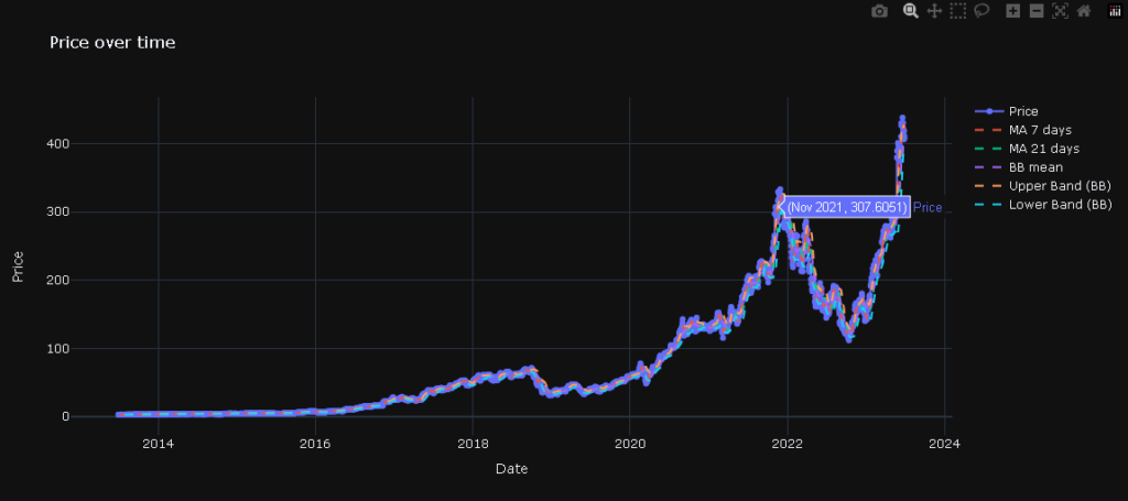
This is a bit crowded but we can zoom in/out and remove or consider any lines we want, so let’s zoom in while removing BB mean, upper band, and lower band:
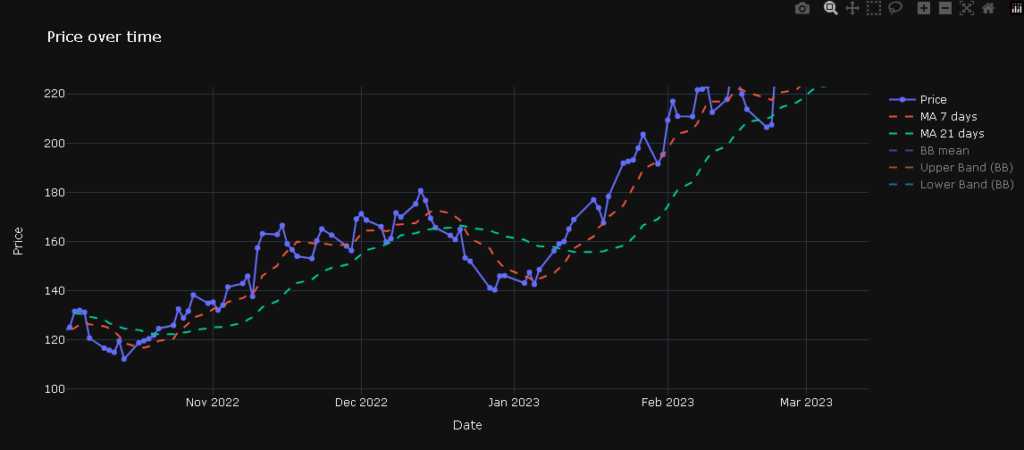
By checking this end-of-2023 period, we notice the MA of the 7-day period intersects with the 21-day period. This usually means a change in trend as we can see on the chart.
We might say that having the MA with the less period interval (7 days) above means that current prices are higher than the old ones on average, that is, an upward trend, while the opposite can also happen. We can see the price varying while this happens.
Finally, let’s check the Bollinger bands.
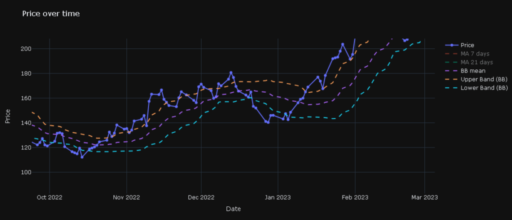
NVIDIA had atypical volatility in this period due to buzz around AI graphics cards, but we can see that the price generally keeps varying between the Bollinger bands, always targeting the 20-day MA — which is the middle band.
If the price reaches the upper band, it seeks the middle (causing a reduction in price), when it reaches the lower band it also seeks the middle band, causing the price to go up, as we can see in this chart image.
That being said, Bollinger Bands are good indicators for verifying asset volatility and preparing for price trends.
That was it for this post!
Feel free to reach out in the commentary section to suggest new posts and ask questions about this one!