Correlation analysis plays a pivotal role in the dynamic world of the financial market. It is a statistical metric that quantifies the relationship between two financial assets, offering valuable insights for investors and analysts. In this post, we will explore the significance of correlation in the financial market, highlighting its role in decision-making and investment strategies.
What is Correlation:
Put, correlation refers to the statistical measure that describes the extent of interdependence between two variables. In the financial context, these variables often represent the performance of assets such as stocks, bonds, or commodities. Correlation ranges from -1 to 1, indicating the direction and strength of the relationship between assets.
Correlation of 1 or -1 in Practice:
- Positive Correlation of 1:
- Meaning: A correlation of 1 implies a perfect positive relationship between two financial assets.
- Practical Impact: When one asset rises, the other also rises in the same proportion. These assets move in synchrony, reflecting a strong positive association.
- Negative Correlation of -1:
- Meaning: A correlation of -1 indicates a perfect negative relationship between two financial assets.
- Practical Impact: When one asset rises, the other falls in the same proportion, and vice versa. These assets move in opposite directions, demonstrating a strong negative association.
It’s important to note that a correlation of 0 signifies the absence of correlation, indicating no apparent linear relationship between the assets. It’s worth emphasizing that correlation does not imply causation, meaning that just because two assets are correlated doesn’t necessarily mean that one causes the movement of the other.
Why Use Correlation in the Financial Market:
- Portfolio Diversification: Correlation assists in building balanced portfolios. Assets with low correlation tend to move independently, reducing the overall portfolio risk.
- Risk Management: Understanding the correlation between assets helps investors assess the risk associated with specific positions. Negative correlations can offer protection during periods of volatility.
- Informed Decision-Making: By analyzing the correlation between different sectors or asset classes, investors can make more informed decisions regarding resource allocation and trading strategies.
How Correlation is Calculated:
Correlation calculation is often done using coefficients, the most common being the Pearson correlation coefficient. This coefficient is obtained by dividing the covariance between the two assets by the product of their standard deviations.
The formula is given by:
Correlation=Covariance(A,B) / [Standard Deviation(A)×Standard Deviation(B)]
The resulting correlation varies from -1 (perfect negative correlation) to 1 (perfect positive correlation).
Code example
First, let’s check the correlation between NVIDIA and TESLA stocks from 2020-01-01 to 2024-01-01 as an example
Here is the code to do so:
import yfinance as yf
import matplotlib.pyplot as plt

# historic data
tesla = yf.download('TSLA', start='2020-01-01', end='2024-01-01')
nvda = yf.download('NVDA', start='2020-01-01', end='2024-01-01')

# Adj closed prices
tesla_close = tesla['Adj Close']
nvda_close = nvda['Adj Close']

# Correlation
correlation = tesla_close.corr(nvda_close)

# Plotting graphs
plt.figure(figsize=(10, 5))
tesla_close.plot(label='Tesla')
nvda_close.plot(label='NVIDIA')
plt.title('Correlation between Tesla and NVIDIA')
plt.xlabel('Date')
plt.ylabel('Adj Close price')
plt.legend()
plt.show()

# correlation
print(f'The correlation is: {correlation:.2f}')
Here is the output for this code:
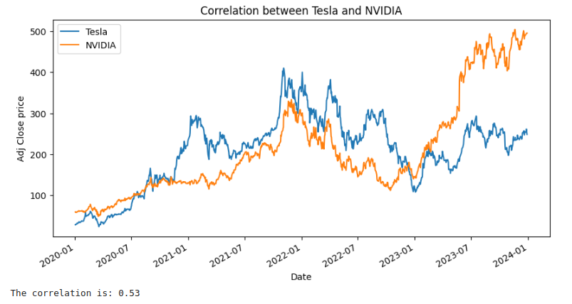
If we check the graphs, we can see they look correlated in some points, but not that much considering the whole period, so this explains the correlation of 0.53 that we found. Furthermore, the companies don’t seem to be directly related.
Now, let’s consider a similar code, but for companies BYD and TESLA:
import yfinance as yf
import matplotlib.pyplot as plt

# historic data
tesla = yf.download('TSLA', start='2020-01-01', end='2024-01-01')
byd = yf.download('BYDDF', start='2020-01-01', end='2024-01-01')  # BYD from OTC EUA

# Adj closed prices
tesla_close = tesla['Adj Close']
byd_close = byd['Adj Close']

# Correlation
correlation = tesla_close.corr(byd_close)

# Plotting graphs
plt.figure(figsize=(10, 5))
tesla_close.plot(label='Tesla')
byd_close.plot(label='BYD')
plt.title('Correlation between Tesla and BYD')
plt.xlabel('Date')
plt.ylabel('Adj Close price')
plt.legend()
plt.show()

# correlation
print(f'The correlation is: {correlation:.2f}')
And here is the output for this one:
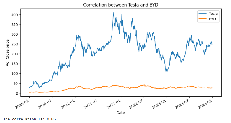
We can barely see the variations in BYD stock price, so let’s print it separately. Just remove the references of TESLA in the latest code:
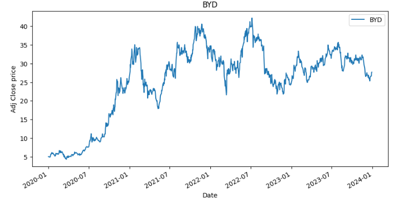
Now it’s easier to see the correlation with TESLA stock.
Notice we are not worried about stock price, but more about the price variations. As the graphs look similar, the 0.86 correlation we found makes sense.
On top of that, both are companies in the transport sector and more specifically electric cars, so it makes sense that companies in the same sector vary as the sector varies, corroborating with the big correlation we see.
In this case, the electric car market has grown a lot and we see this with the growth of the company’s shares!
Well, that’s what we planned for this post!
Please let me know in the comments section what you want to see next around here! I’ll be waiting for you!