The Moving Average Convergence Divergence (MACD) is a popular technical indicator widely used in stock trading.
It provides valuable insights into the momentum and potential trend reversals of a stock.
In this blog post, we’ll explore the concept of MACD, its purpose, and how to interpret the information provided in the Python code snippet for the NVDA stock.
What is MACD?
MACD is a trend-following momentum indicator that shows the relationship between two moving averages of a security’s price. It consists of three main components:
- MACD Line (Blue Line): The 12-day Exponential Moving Average (EMA) minus the 26-day EMA. The result is a line that oscillates above and below zero.
- Signal Line (Red Line): This is the 9-day EMA of the MACD Line. It acts as a trigger for buying and selling signals.
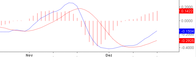
- Histogram: The Histogram is not mandatory, but it helps a lot! The vertical bars represent the difference between the MACD and Signal Line. A rising histogram indicates increasing momentum, while a falling histogram signals decreasing momentum.
Purpose of MACD
The primary purpose of MACD is to identify potential changes in the strength, direction, momentum, and duration of a stock’s trend. Traders use it to:
- Spot Trend Reversals: Crossovers between the MACD Line and the Signal Line can indicate a potential trend reversal.
- Confirm Trend Strength: The distance between the MACD Line and the Signal Line reflects the current trend’s strength.
- Generate Buy/Sell Signals: Traders often look for crossovers between the MACD Line and the Signal Line to determine optimal entry and exit points.
Interpreting and using MACD
When employing the MACD indicator for stock trading decisions, traders primarily focus on the crossovers and divergences between the MACD Line (blue) and the Signal Line (red).
A common strategy involves identifying potential entry points for buying or selling based on these interactions. A bullish signal is generated when the MACD Line (Blue) crosses above the Signal Line (Red), suggesting an upward trend. This may be considered an opportune moment to buy a stock.
Conversely, a bearish signal occurs when the MACD Line (Blue) crosses below the Signal Line (Red), indicating a potential downturn, and may be interpreted as a signal to sell.
Additionally, traders often pay attention to the histogram’s behavior, as a rising histogram above the zero line strengthens the case for a bullish trend. In contrast, a falling histogram below zero suggests a bearish trend. It’s crucial to note that while MACD provides valuable insights, combining its signals with other technical and fundamental analysis tools can enhance the robustness of trading decisions.
Case Study: Building MACD for NVIDIA stock in Python
For creating MACD graph in Python we will need three libraries: yfinance for reading the stock data, pandas for calculating the exponential moving averages and matplotlib for the graph.
The first part of the code looks like this
import yfinance as yf
import pandas as pd
import matplotlib.pyplot as plt

start_date = "2023-01-01"
end_date = "2023-06-30"

symbol = "NVDA"

data = yf.download(symbol, start=start_date, end=end_date)
This will import the libraries and reading data for NVIDIA stock from 2023-01-01 to 2023-06-30.
Now, for calculating the MACD line and the signal line we need to use the Adjusted Close price (just to be safe about the stock grouping, etc), and calculate the exponential moving average.
We will use the pandas ewm function to do so. Here is what it will look like:
# Calculate 12-day and 26-day Exponential Moving Averages (EMA)
data['ema12'] = data['Adj Close'].ewm(span=12, adjust=False).mean()
data['ema26'] = data['Adj Close'].ewm(span=26, adjust=False).mean()

# Calculate MACD line (the difference between 12-day and 26-day EMAs)
data['macd'] = data['ema12'] - data['ema26']

# Calculate the signal line (9-day EMA of the MACD line)
data['signal'] = data['macd'].ewm(span=9, adjust=False).mean()
Notice we didn’t adjust the ewn calculation (adjust=False) but you can!
This adjustment makes the curve and MACD values smoother. This is interesting in large time intervals.
Finally, here is the code to show these values in a graph:
# Plot the chart with MACD and signal lines
plt.figure(figsize=(10, 6))
plt.plot(data['macd'], label='MACD', color='blue')
plt.plot(data['signal'], label='Signal', color='red')
plt.legend(loc='upper left')
plt.title('MACD and Signal Line for NVIDIA')
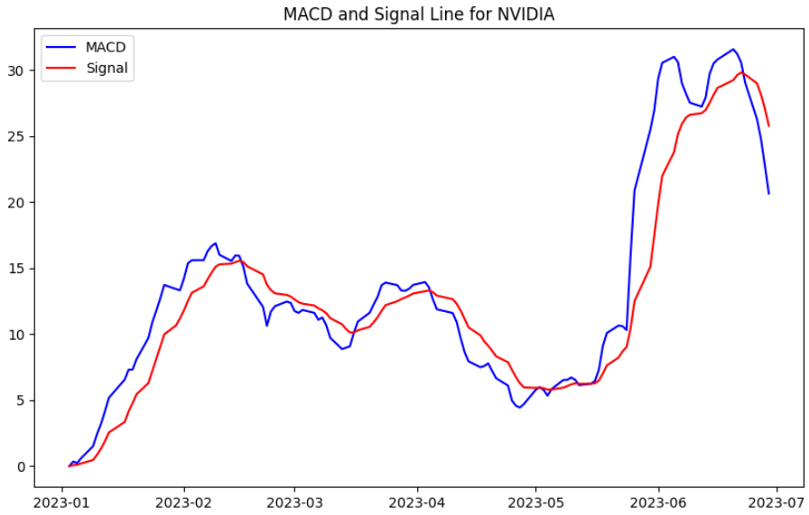
plt.show()Here is what the graph looks like:
Just for comparison, here is some code for checking the Adjusted Close price for NVIDIA in this same period:
plt.figure(figsize=(10, 6))
plt.plot(data['Adj Close'],color='blue')
plt.title('Adj Close for NVIDIA')
plt.show()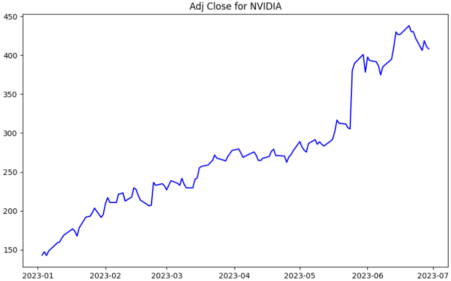
Notice this graph contains enormous values for MACD — up to 30. This happened because the up trend was strong so we had no negative MACD in this period. However, we had some gaps between MACD and the signal that could lead to orders and operations.
To finish this graph, let’s add the histogram to help you visualize the trends and values.
Here’s the complete code again, this time adding lines for the histogram:
import yfinance as yf
import pandas as pd
import matplotlib.pyplot as plt

start_date = "2023-01-01"
end_date = "2023-06-30"

symbol = "NVDA"

data = yf.download(symbol, start=start_date, end=end_date)

# Calculate 12-day and 26-day Exponential Moving Averages (EMA)
data['ema12'] = data['Adj Close'].ewm(span=12).mean()
data['ema26'] = data['Adj Close'].ewm(span=26).mean()

# Calculate MACD line (the difference between 12-day and 26-day EMAs)
data['macd'] = data['ema12'] - data['ema26']

# Calculate the signal line (9-day EMA of the MACD line)
data['signal'] = data['macd'].ewm(span=9).mean()

data['histogram'] = data['macd'] - data['signal']

# Plot the chart with MACD, signal and histogram bar
plt.figure(figsize=(10, 6))
plt.plot(data['macd'], label='MACD', color='blue')
plt.plot(data['signal'], label='Signal', color='red')
plt.bar(data.index, data['histogram'], label='Histogram', color='gray', alpha=0.5)
plt.legend(loc='upper left')
plt.title('MACD indicator for NVIDIA')
plt.show()
Here is the final product
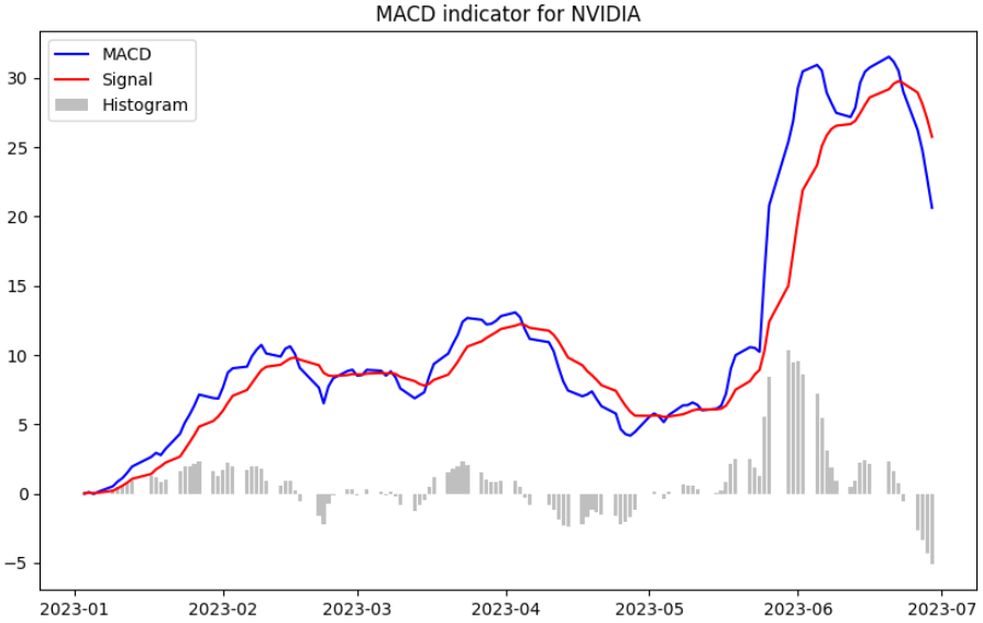
We can check the price fluctuations. The histogram shows the giant gap we had between the signal and MACD at the beginning of June. This probably happened due to the demands on NVIDIA chips for generative AI usage.
Another thing you may notice is that there are some gaps in the graph. These are non-trading days that we didn’t remove from the graph… well, about this, we plan on having a post specifically for this later.. maybe the next one?
That was it for this post! Hope you understood a bit more about MACD and how this can help analyze stocks!
Let me know what you think about MACD in the commentaries section!